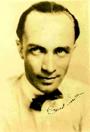
The Conrad Veidt Society
Silent film, once thought dead and buried, except by a very few dedicated film buffs, has experienced a phenomenal revival of critical and public interest in the past fifteen years. Sparked initially by the advent of home video, and by theatrical presentations with full orchestra (particularly Abel Gance's Napoleon), silent films are now regularly released on tape and laser disc and screened in theaters around the U.S. and Europe. At the forefront of the movement in the United States is a man author Scott Eyman has called one of film history's best friends: film historian and preservationist David Shepard, who has dedicated his professional life to restoring and promoting silent films and introducing them to a new generation.
Raised in Englewood, NJ, Shepard's fascination with silent film began with a neighbor who owned a collection of hundreds of old movie prints. The neighbor gave a screening every Sunday afternoon in his basement theater to friends and the local kids, including Shepard, and the love that Shepard acquired for silent film in that basement theater launched him into a career that has taken him to teaching at UCLA and USC, working with The Director's Guild and the American Film Institute and finally to forming his own company for restoring films for theatrical screenings and home video release. He is a also recipient of the International Documentary Association's Preservation and Scholarship Award.
During his time at the AFI, Shepard worked with the then-thriving, now defunct Blackhawk Films in order to borrow their materials and preserve them for archival purposes. After several years, Shepard left the AFI to join Blackhawk, where he supervised many preservations and restorations. He eventually left the company and in 1986 created his own business, Film Preservation Associates. After Blackhawk was sold to a new management which reduced its services, Shepard began to acquire Blackhawk's holdings, and when the company finally folded, he bought Blackhawk's entire library.
Shepard and Film Preservation Associates have continued to care for and restore these films and have shared their treasures through home video release on tape and laser disc. Their releases have included many outstanding sets, such as Chaplin: Legacy of Laughter, The Art of Buster Keaton, The Golden Age of German Cinema First American Features and the Classics of Early Soviet Cinema series, F.W. Murnau's Nosferatu, The Last Laugh and Sunrise; many short and feature films directed by D.W. Griffith; all the features of Douglas Fairbanks, Sr.; as well as dozens of individual films (Seventh Heaven, Cobra, Tol'able David, The Cat and the Canary, The Hunchback of Notre Dame, and Dr. Jekyll and Mr. Hyde, to name just a few). His latest release is The Slapstick Encyclopedia, a compilation of short films highlighting the work of the funny men and women of early comedy. While nothing will ever replace a theatrical screening as the best way to see a film, Shepard's home video releases have proved to be a real treat for silent film fans. He commissions new scores when necessary -- and if there is an original synchronized score, the laser discs will carry the new score on a second audio track -- and includes supplementary material such as cut footage, interviews with surviving production staffers, and audio commentary by film scholars.
For Conrad Veidt fans, the Shepard release of greatest interest is The Cabinet of Dr. Caligari, which Video Watchdog applauded as another superb restoration job by David Shepard and Film Preservation Associates. For this Special Collector's Edition of the film, FPA digitally mastered Caligari at the visually-correct speed of 18 frames per second from a fine, full-frame early generation 35mm print of the German reissue and color-tinted it according to one of the color plans followed in the film's different releases during the silent era. FPA also provided new English-language titles which are graphic reproductions of the hand-painted Expressionist titles from the original 1920 release. Timothy Brock composed and conducted a new -- and wonderfully morbid -- score for string orchestra based on early 20th century avant-garde music. The laser disc also features an audio essay by Florida Atlantic University professor Mike Budd, the editor of The Cabinet of Dr. Caligari: Texts, Contexts, Histories, as well as excerpts from the film's original publicity material and photos of the theater in which the film premiered. Both tape and laser disc include excerpts from Genuine, a follow-up Expressionist film directed by Caligari's director Robert Wiene.
Last April (1998), David Shepard traveled to Atlanta at the invitation of Bill Eggert, founder and director of the Silent Film Society of Atlanta, to present the Silent Heaven Film Festival. He brought with him seven prints, which the Festival screened over two days, including Seventh Heaven, Steamboat Bill, Jr., Miss Lulu Bett, and Orphans of the Storm. Despite the lateness of the hour after the first day's screening -- it was midnight, which seems only fitting for an interview about about one of the cinema's greatest horror films -- Shepard graciously agreed to talk about his edition of The Cabinet of Dr. Caligari.
With so many films, including the films in the Blackhawk Collection, in need of restoration, how did you come to decide on restoring The Cabinet of Dr. Caligari?
The Cabinet of Dr. Caligari is one of those seminal films that still resonates with a modern audience. Not only is it famous and the subject of much discussion, both ancient and modern, but it also actually works. People find it a really interesting film, because it can be read as an art work or simply as a melodrama. But I don't do something at all unless I feel it can be done well, because there are lots of films and there's no point to putting out something that's not first class unless I know there is no chance of getting anything better. Therefore, even though there was material in the Blackhawk material on Caligari and the company had sold it successfully in 8mm for many years with no complaints about the quality, I didn't regard the material as good enough to use for the kind of expensive production I felt a film of that stature would warrant. So I simply waited. I was aware that good material existed, but it was not within my reach. Then, as it happened, I was able to obtain it, and once I had a 35mm early generation print to work with, I felt there was a chance to do it in a way that would be exemplary. If anything is going to generate returns sufficient to repay an investment, it will be a film such as Caligari. With so many versions of the film already in the marketplace, there's no point to do it unless it can be done well.
Where did you acquire this 35-mm print?
The source material is a print from Russia. It was the 1923 German reissue version, which even at that time, I believe, was printed from a dupe negative. It is a black and white print of excellent photographic quality. So that was the base, where we started. Then came the matter of putting the film onto tape. We ran it at 18 frames a second, based upon what I could find of the running time in the original reviews and the published recommendation from the Stiftung Deutsche Kinemathek, and the fact that in looking at the film, these things seemed to make sense. Then there were three further elements to be dealt with. One was the intertitles. Second was the tints and the third was the music. With respect to the intertitles, I felt that it was important, if in any way possible, to try and recreate the calligraphic German titles. And it was possible, although it was difficult.
Did you have a print with the original titles?
The only copy with the original titles that we knew of was a 16mm print which had been in the family of Hans Janowitz, one of the Caligaris writers. I obtained a videotape of that. The 16mm print was in pretty rough shape and the titles, as well as the rest of the film, were full of white snow from negative dirt when the print was made. But of course it gave us two things: one was the accurate German text and the other was the painted backgrounds. We started off with this tape, which was a VHS PAL tape, and did video captures of each title frame. Then we extracted the German letters and made a font of them. As the titles were hand-lettered, in some instances there were variant designs for letters, especially, for example, letters that ended words. So if there were, as there were, two or three different R's, we would get all of them. There are certain letters which didn't occur in the German text. I believe J was one of them, for example. We designed new letters in the same style for the ones that were not in the film. Then we took the backgrounds and painted out all of the flecks and dirt, and painted in all of the holes that had been left when the titles were removed. The background for each title was different. It's not just one art background for all 72 titles. Two titles and a couple of shots were missing from the German version. So those little bits I filled in from the existing Blackhawk material. You can see quality shifts here and there in the final result. I painted new backgrounds for the missing titles.
The only copy with the original titles that we knew of was a 16mm print which had been in the family of Hans Janowitz, one of the Caligaris writers. I obtained a videotape of that. The 16mm print was in pretty rough shape and the titles, as well as the rest of the film, were full of white snow from negative dirt when the print was made. But of course it gave us two things: one was the accurate German text and the other was the painted backgrounds. We started off with this tape, which was a VHS PAL tape, and did video captures of each title frame. Then we extracted the German letters and made a font of them. As the titles were hand-lettered, in some instances there were variant designs for letters, especially, for example, letters that ended words. So if there were, as there were, two or three different R's, we would get all of them. There are certain letters which didn't occur in the German text. I believe J was one of them, for example. We designed new letters in the same style for the ones that were not in the film. Then we took the backgrounds and painted out all of the flecks and dirt, and painted in all of the holes that had been left when the titles were removed. The background for each title was different. It's not just one art background for all 72 titles. Two titles and a couple of shots were missing from the German version. So those little bits I filled in from the existing Blackhawk material. You can see quality shifts here and there in the final result. I painted new backgrounds for the missing titles.
You yourself painted them?
Yes. It was fun, and they're in the spirit of the rest. It also puts some original artwork in the film, which helps strengthen the copyright that we took out to protect the great deal of money we spent restoring the film.
Could you tell me which titles you painted?
No, of course not! [laughs] Then, we reset the titles in English, using the original lettering on the now restored and repainted backgrounds. We prepared new translations of the German text. They are rather different than the translations that have been circulating all these years. Those all derive from the Museum of Modern Art's edition that was prepared in the 1930s. So that's how we dealt with the titles.
Then, as to how we dealt with the music. The original score, as used in the United States at least, was a compilation score of what was then thought by the compilers to be modern music. This compilation score was available; it was easily found what the selections were. But I made the decision, as I have recently with Nanook of the North, which I am now working on and for which we have the original 1922 score, that to simply use that music would turn the film into a corny museum piece. It was not, after all, the choice of the original filmmakers to have that music. It was done under the supervision of the American distributors or probably under the supervision of Major Bowes, because the film first played here at his Capitol Theatre [in New York City].
What about the original German score?
I don't know anything about the original German score. All I know is that German copyrights are essentially impossible to untangle, so I didn't try. I commissioned a new score from Timothy Brock, and I thought he did a wonderful job. We have two versions of it. It was originally going to be done for 28-piece string orchestra. Then, largely because of time constraints -- we had an announced deadline that was getting close -- we reworked it, because Tim couldn't find that many good string players in Seattle that he wanted to work with. We worked it down to a string sextet, although we have the scores and parts now for both versions, and we are going to start presenting it as a concert attraction and use whatever score the venue wants to play. If they can find 28 good string players, well, God be with them. So we recorded the score and the music was new. It was an artistic choice, one I think we were very fortunate on.
As to the tints, I had looked at two tinted prints from Europe. One was from Germany, one was from Spain. They were quite different. But I had notes as to what colors they used and I also found descriptions of the original film that made reference to the tints and the colors of the various scenes. Even though the version that was restored under the Lumiere 2000 project used the Spanish copy, the German copy seemed more sensible to me and was absolutely in line with the contemporary descriptions of the tints. So basically that's what I used in a very simple pattern in which the night exteriors are blue, the day interiors are sepia. They were called brown in the original descriptions, but I believe that probably was meant to be sepia. We have some amber, as I recall, or orange. All of the intertitles were green except in a few instances where the shots were green and then the titles were blue. Also, I decided to go with straw titles for all blue and green shots surrounding and green titles for all warm color shots surrounding. But of course the film makes so much more sense tinted that it's hard to imagine that anybody would even ever had interpreted it correctly when it was simply in black and white. And basically, that's how we solved those problems of completing the material, dealing with the titles, dealing with the tints, dealing with the music.
Many of the scenes in my laser disc version of Caligari have a thin, semi-opaque black bar running across the top of the frame. What caused that?
In the very early days of cinema, there was no standard position for the frame line between 35mm frames. Some cameras put it on the center of the perforation, and other cameras, beginning with the Bell and Howell metal camera from 1907, which became the industry standard, put the frame line midway between two perforations. So certainly by the beginning of the feature film era, except for films shot with very old equipment, the frame line was standard midway between two perforations, although there were still some non-standard systems in use. For example, the Biograph camera which puts the frame line on the perforation and uses unperforated film which is perforated by the camera. So there were various non-standard systems. But essentially Bell and Howell's cinemachinery standardized the perforation system and the frame line position. Step register printers, which were printers that printed the negative off one frame at a time, as opposed to running it in a continuous movement past a narrow slit of light, were set up for a frame line being between the perfs. Caligari was shot with what was even then a very, very old camera, probably an obsolete camera. The original negative has the frame lines on the centers of the perfs, not between them. However, when the material was printed and when the early generation dupe negative was made, it was done on a step printer in order to ensure maximum sharpness. But the step printer was set up to deal with frame lines between, so it added a second frameline in addition to the one that was already there because of the camera, with the result that you have two frame lines in each frame of the film. And if you frame for the full height of the film, which means aligning on the camera frameline, then the printer frameline hangs into the picture, unfortunately at the top. If they'd printed the negative from the other end, it would have been at the bottom, where it would have been somewhat less conspicuous. Faced with that, there were then basically three choices. One was to crop the image so that the frameline didn't show. If you look at most editions of Caligari, that's what's been done. Look at the amount of headroom in my version. The tops of arches are there, the little church in Holstenwall at the top of the hill is there, and most important of all, the actors are not cut off at the eyes. If you compare it with other versions, you'll see that all those things are the opposite. The double frameline is sort of annoying, so I took it on myself to go through the film, and decide shot for shot when it was important to have the headroom and when it didn't matter. And on all the shots where it didn't matter, I cropped it out. On all the shots where I thought it was important, because there was some important setpiece there or because the actors' eyes were there, I left it in. And that's the story of the double frameline.
Thank you, David Shepard and Paula Vitaris.
Raised in Englewood, NJ, Shepard's fascination with silent film began with a neighbor who owned a collection of hundreds of old movie prints. The neighbor gave a screening every Sunday afternoon in his basement theater to friends and the local kids, including Shepard, and the love that Shepard acquired for silent film in that basement theater launched him into a career that has taken him to teaching at UCLA and USC, working with The Director's Guild and the American Film Institute and finally to forming his own company for restoring films for theatrical screenings and home video release. He is a also recipient of the International Documentary Association's Preservation and Scholarship Award.
During his time at the AFI, Shepard worked with the then-
Shepard and Film Preservation Associates have continued to care for and restore these films and have shared their treasures through home video release on tape and laser disc. Their releases have included many outstanding sets, such as Chaplin: Legacy of Laughter, The Art of Buster Keaton, The Golden Age of German Cinema First American Features and the Classics of Early Soviet Cinema series, F.W. Murnau's Nosferatu, The Last Laugh and Sunrise; many short and feature films directed by D.W. Griffith; all the features of Douglas Fairbanks, Sr.; as well as dozens of individual films (Seventh Heaven, Cobra, Tol'able David, The Cat and the Canary, The Hunchback of Notre Dame, and Dr. Jekyll and Mr. Hyde, to name just a few). His latest release is The Slapstick Encyclopedia, a compilation of short films highlighting the work of the funny men and women of early comedy. While nothing will ever replace a theatrical screening as the best way to see a film, Shepard's home video releases have proved to be a real treat for silent film fans. He commissions new scores when necessary -
For Conrad Veidt fans, the Shepard release of greatest interest is The Cabinet of Dr. Caligari, which Video Watchdog applauded as another superb restoration job by David Shepard and Film Preservation Associates. For this Special Collector's Edition of the film, FPA digitally mastered Caligari at the visually-
Last April (1998), David Shepard traveled to Atlanta at the invitation of Bill Eggert, founder and director of the Silent Film Society of Atlanta, to present the Silent Heaven Film Festival. He brought with him seven prints, which the Festival screened over two days, including Seventh Heaven, Steamboat Bill, Jr., Miss Lulu Bett, and Orphans of the Storm. Despite the lateness of the hour after the first day's screening -
With so many films, including the films in the Blackhawk Collection, in need of restoration, how did you come to decide on restoring The Cabinet of Dr. Caligari?
The Cabinet of Dr. Caligari is one of those seminal films that still resonates with a modern audience. Not only is it famous and the subject of much discussion, both ancient and modern, but it also actually works. People find it a really interesting film, because it can be read as an art work or simply as a melodrama. But I don't do something at all unless I feel it can be done well, because there are lots of films and there's no point to putting out something that's not first class unless I know there is no chance of getting anything better. Therefore, even though there was material in the Blackhawk material on Caligari and the company had sold it successfully in 8mm for many years with no complaints about the quality, I didn't regard the material as good enough to use for the kind of expensive production I felt a film of that stature would warrant. So I simply waited. I was aware that good material existed, but it was not within my reach. Then, as it happened, I was able to obtain it, and once I had a 35mm early generation print to work with, I felt there was a chance to do it in a way that would be exemplary. If anything is going to generate returns sufficient to repay an investment, it will be a film such as Caligari. With so many versions of the film already in the marketplace, there's no point to do it unless it can be done well.
Where did you acquire this 35-
The source material is a print from Russia. It was the 1923 German reissue version, which even at that time, I believe, was printed from a dupe negative. It is a black and white print of excellent photographic quality. So that was the base, where we started. Then came the matter of putting the film onto tape. We ran it at 18 frames a second, based upon what I could find of the running time in the original reviews and the published recommendation from the Stiftung Deutsche Kinemathek, and the fact that in looking at the film, these things seemed to make sense. Then there were three further elements to be dealt with. One was the intertitles. Second was the tints and the third was the music. With respect to the intertitles, I felt that it was important, if in any way possible, to try and recreate the calligraphic German titles. And it was possible, although it was difficult.
Did you have a print with the original titles?
The only copy with the original titles that we knew of was a 16mm print which had been in the family of Hans Janowitz, one of the Caligaris writers. I obtained a videotape of that. The 16mm print was in pretty rough shape and the titles, as well as the rest of the film, were full of white snow from negative dirt when the print was made. But of course it gave us two things: one was the accurate German text and the other was the painted backgrounds. We started off with this tape, which was a VHS PAL tape, and did video captures of each title frame. Then we extracted the German letters and made a font of them. As the titles were hand-
The only copy with the original titles that we knew of was a 16mm print which had been in the family of Hans Janowitz, one of the Caligaris writers. I obtained a videotape of that. The 16mm print was in pretty rough shape and the titles, as well as the rest of the film, were full of white snow from negative dirt when the print was made. But of course it gave us two things: one was the accurate German text and the other was the painted backgrounds. We started off with this tape, which was a VHS PAL tape, and did video captures of each title frame. Then we extracted the German letters and made a font of them. As the titles were hand-
You yourself painted them?
Yes. It was fun, and they're in the spirit of the rest. It also puts some original artwork in the film, which helps strengthen the copyright that we took out to protect the great deal of money we spent restoring the film.
Could you tell me which titles you painted?
No, of course not! [laughs] Then, we reset the titles in English, using the original lettering on the now restored and repainted backgrounds. We prepared new translations of the German text. They are rather different than the translations that have been circulating all these years. Those all derive from the Museum of Modern Art's edition that was prepared in the 1930s. So that's how we dealt with the titles.
Then, as to how we dealt with the music. The original score, as used in the United States at least, was a compilation score of what was then thought by the compilers to be modern music. This compilation score was available; it was easily found what the selections were. But I made the decision, as I have recently with Nanook of the North, which I am now working on and for which we have the original 1922 score, that to simply use that music would turn the film into a corny museum piece. It was not, after all, the choice of the original filmmakers to have that music. It was done under the supervision of the American distributors or probably under the supervision of Major Bowes, because the film first played here at his Capitol Theatre [in New York City].
What about the original German score?
I don't know anything about the original German score. All I know is that German copyrights are essentially impossible to untangle, so I didn't try. I commissioned a new score from Timothy Brock, and I thought he did a wonderful job. We have two versions of it. It was originally going to be done for 28-
As to the tints, I had looked at two tinted prints from Europe. One was from Germany, one was from Spain. They were quite different. But I had notes as to what colors they used and I also found descriptions of the original film that made reference to the tints and the colors of the various scenes. Even though the version that was restored under the Lumiere 2000 project used the Spanish copy, the German copy seemed more sensible to me and was absolutely in line with the contemporary descriptions of the tints. So basically that's what I used in a very simple pattern in which the night exteriors are blue, the day interiors are sepia. They were called brown in the original descriptions, but I believe that probably was meant to be sepia. We have some amber, as I recall, or orange. All of the intertitles were green except in a few instances where the shots were green and then the titles were blue. Also, I decided to go with straw titles for all blue and green shots surrounding and green titles for all warm color shots surrounding. But of course the film makes so much more sense tinted that it's hard to imagine that anybody would even ever had interpreted it correctly when it was simply in black and white. And basically, that's how we solved those problems of completing the material, dealing with the titles, dealing with the tints, dealing with the music.
Many of the scenes in my laser disc version of Caligari have a thin, semi-
In the very early days of cinema, there was no standard position for the frame line between 35mm frames. Some cameras put it on the center of the perforation, and other cameras, beginning with the Bell and Howell metal camera from 1907, which became the industry standard, put the frame line midway between two perforations. So certainly by the beginning of the feature film era, except for films shot with very old equipment, the frame line was standard midway between two perforations, although there were still some non-
Thank you, David Shepard and Paula Vitaris.
A New Master for Cesare
An interview with on the remastered home video edition of The Cabinet of Dr. Caligari.
By Paula Vitaris
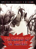
The latest version of David Shepherd ‘s restoration, in the newer DVD format